Showing posts with label Digipak. Show all posts

Wednesday, 18 January 2012

Ancillary Task Changes

After creating my magazine advert, I began to create my digipak. I found a template on the internet with 6 panels.

I insterted my first image to the front panel of the digipak and the band logo/name.
As I began to plan how I wanted the rest of my digipak would look, I realised that the design and theme would end very similar to my magazine advert. Due to this, I decided that I wanted to do something a bit different, so I have decided to begin making a band website!
To create my website, I decided to use the free website creator 'Wix'.
Although there are a number of music templates to choose from on the Wix website, I decided to use a completely blank page to start from scratch. This would enable me to create the page exactly how I wanted! However before a begin I need to look at some examples of alternative rock band websites.


Sunday, 20 November 2011

Creating My Magazine Advert

My model came over to the photography studio after school so that I could take some photographs of her holding my signs. She was really willing to pose how I wanted and was comfortable with the shots. She is also 18 so there are no problems with the suggested nudity. I needed to take some test shots first to make sure the studio lighting was correct and that the camera was focused.
 
 
 It didn't take long because I knew exactly what I wanted the photographs to look like. I took shots with the model in different parts of the frame; below are a few of the results.
I decided that the last photo would look good on the magazine advert, where as the landscape, more centred photos would look best on the album cover. I was really pleased with the photos as they looks really effective and the signs stood out too.
I needed to create a new band 'logo' to go on both my advert and my digipak. This time I just went for black and white as I thought this would go best with my photo; I did not want the writing to take away from the photo, just to soften it slightly. 
I went online to look for a suitable font. In the past I have found this method really useful as you can discover some really unusual but effective fonts to download for free. I came across one called 'Bright Young Things'. When I gained feedback, many agreed that the font went with the alternative rock genre of my song, which was really good to know. I decided to use this font for my logo.
I did need to retouch the photographs a bit. I found this quite easy as I have used photoshop before. I used the clone stamp tool to edit the underwear out of the photograph as I felt it was ruining the illusion.
 Although some adverts do not feature a record label logo, I decided to add mine. I found the Beggars Banquet logo online and pulled that onto the poster. I decided to put it in the bottom right corner of the poster so it is not too obvious but can subtly be seen.
 I erased some of the background on the image to make it blend in nicely with the advert background.
The finished advert! I will be getting some audience feedback on it to see how effective it is.

Monday, 14 November 2011

Developing My Advert Idea

After creating my mock-up advert, I realised that I needed to research some other alterntive rock magazine adverts. It proved quite difficult to find them as many 'rock' magazines such as "Kerrang!" didn't actually feature any advert for albums. I had a look on the internet too, though the more common adverts were for the pop and RnB genres. Through research of these adverts however I found that many share the same image as the album cover. I think that I would like my advert image and digipak cover image to be the same or similar.
Here are some album covers taken from 'alternative rock' artists or similar genres.


I have decided to go right back to basics and think about literal ideas of my band and album name. Obviously 'naked truth' can be represented quite literally, what with the basis of my video I thought it would be a fitting idea.
The cover above also inspired me. I really love the idea of using a sign with the album name written on it. I really want to make two signs out of cardboard; one that says "Naked" and the other "Truth". I want them to be held over a woman's body, the first to cover her breasts and the second to cover her bottom half. Although she will appear to be naked behind the signs, she won't be.

Tuesday, 11 October 2011

Digipak Styles

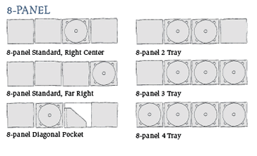
These are a few examples of the different panel designs you can use for a digipak. I found these on a really great website, which makes all of the digipaks from 100% Green Forestry Practices Certified board stock and high-quality vegetable based ink on both the boards and the discs. What I really love about these digipaks in particular is the custom designs people have ordered. I especially like this one: 

I really like the unique idea of the middle panel having a pocket in it for a small booklet. This would be great for a booklet featuring the lyrics of the songs, which you often see with albums. I would also like to use a 6 panel digipak as there is more opportunity for adding different features such as a list of tracks, the lyric booklet, disc tray and plenty of images. I'm really excited about creating a digipak and can't wait to decide what I would like the end result to look like!

Digipak and Album Cover Research

I have started to look at different digipak designs to help me form an idea of what I would like my own digipak to look like.


The traditional and more common form of CD packages are jewel cases. The clear plastic cases are made up of three pieces of plastic. Digipaks however, typically consists of paperboard or card panels with one or more plastic trays to hold the disc(s). You can also get digipaks which have 'soft-spots' rather than a plastic tray, usually a small circle of felt which you can pop the CD onto. Digipak editions of albums are often of limited edition and contain bonus tracks.


I began by looking at a few different digipaks from all genres, to compare and contrast them, as it's quite difficult to pin-point just what alternative rock is as a genre. It's a pretty vast area as there are so many sub-genres within it. I feel that my track is most likely 'noise-pop'. Also, through my band and record label research I realised that often alternative rock groups and artists use a fusion of many different genres to create their own 'unique' sound. 


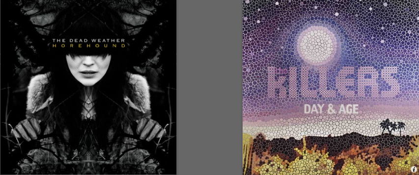
My favourite cover out of these is probably the Dead Weather: Horehound cover. The darkness and tree like shapes in the background are similar to the sinister theme I wanted to convey in my own video. Though, if I wanted to base my digipak on a lighter tone I also like the Paramore cover featuring the butterfly as it is simple yet effective and the bright butterfly wings really catch your eye.

The Dead Weather - Horehound (2009)