Showing posts with label Ideas. Show all posts

Tuesday, 15 November 2011

Preparing for My Advert Photoshoot

I had an idea in my head of what I wanted my signs to look like for the album cover image/advert image. I wanted the signs to stand out a bit more rather than just write on cardboard, so I decided to try cutting out each letter and sticking them on another piece of cardboard. 
I started by printing out the words 'Naked Truth' off the computer, in a font I liked, large, on two pieces of A4 paper. I then cut out each letter individually, put it on a piece of cardboard and drew around it in pencil.
I then used a small craft knife to cut out the cardboard letter. This proved really tricky!
Both words completed.
I also had to make sure the cardboard was wide enough to cover the body.
To make the sign stand out more I decided to put a border of cardboard around the edges, made out of strips of leftover cardboard.
I just stuck the letters and border on using Prit-stick.
I found that when I took photographs of the signs using the flash, the letters didn't stand out. I coloured in the letters and borders using black marker pen.
The final signs! I am really, really pleased with how they look and hope they look good in my photographs.

Monday, 14 November 2011

Developing My Advert Idea

After creating my mock-up advert, I realised that I needed to research some other alterntive rock magazine adverts. It proved quite difficult to find them as many 'rock' magazines such as "Kerrang!" didn't actually feature any advert for albums. I had a look on the internet too, though the more common adverts were for the pop and RnB genres. Through research of these adverts however I found that many share the same image as the album cover. I think that I would like my advert image and digipak cover image to be the same or similar.
Here are some album covers taken from 'alternative rock' artists or similar genres.


I have decided to go right back to basics and think about literal ideas of my band and album name. Obviously 'naked truth' can be represented quite literally, what with the basis of my video I thought it would be a fitting idea.
The cover above also inspired me. I really love the idea of using a sign with the album name written on it. I really want to make two signs out of cardboard; one that says "Naked" and the other "Truth". I want them to be held over a woman's body, the first to cover her breasts and the second to cover her bottom half. Although she will appear to be naked behind the signs, she won't be.

Sunday, 13 November 2011

Logos and Magazine Adverts

After choosing what my band would be called a began to experiment with some logos which I could use on the magazine advert and the digipak. This is an initial logo I have come up with. I decided to link the first letter of each word as they are all nicely curved. Obviously the acronym of the band name is SOD! I also thought the logo needed some colour and decided to use the colour red because black and red are recognised colours within the 'rock' genre.
I then changed the font used in my logo and decided that I preferred this one.
Even without thinking about designing my advert, I was playing around with some new Photoshop 'brushes' and created the image below. Even though I was just messing around, I was really pleased with the effect they gave and thought this may look quite good on an advert.
I then started to create an advert as a 'mock-up', just adding whatever came to mind and laying it out in different ways. 
When looking for feedback, it was apparent that "Naked Truth" looked more like the name of the band, rather than the name of the album.
I decided to swap the two titles around to make it very clear that "Second One Down" was the band name and "Naked Truth" was the album name and it looked much better.
 However, this poster was only a mock-up. Other feedback I received revealed that people thought it looked more like a film poster than an advert and quite like a 'Twilight' film poster in particular. Although this was not an adequate advert, I have learnt a lot through the process, especially that feedback from others is invaluable!
I also need to look at some alternative rock magazine adverts to get an idea of the kinds of images and text they use to advertise bands and albums.

Friday, 11 November 2011

Names, Names, Names!


As I need to start creating my poster and digipak, I really needed to come up with names for the band, album and the song! It was a lot more difficult than I thought it would be. I began by looking at the lyrics in my song for song names and jotted down any names that came to mind. I also looked at the names of current alternative rock bands on Wikipedia to get a feel for the types of names I could use.


The names I have decided on are:
Band Name - Second One Down
Album Name - Naked Truth   (second choice was Preserving Common Sense)
Song Name - Breaking Apart   (second choice was Mirrors)

Friday, 28 October 2011

Shot Ideas

Whilst watching last week's episode of 'Casualty', a sequence of shots caught my eye. The storyline has been on-going based on a ex-prostitute, Annie. At the beginning of the episode Annie was visited by another of the prostitutes who wanted to warn her to run away before their pimp found out where she was. It turns out that the pimp found Annie's house and was waiting there when the other prostitute turns up.

I thought it was interesting how the different shots conveyed someone being watched, in a sinister way. I'd really like to try and create the same effect within my music video!

Friday, 14 October 2011

Location Shoot

As I changed my concept, I have also changed my location ideas! I still want to use a forest, however I thought that if I filmed in the forest near my house, it would be very difficult to carry all my equipment up there. I also wanted some bedroom and living room scenes, however I did not feel that my own house would be suitable. This is because it's very homely and it's clearly lived in by adults too. I want Kristie's character to come across as isolated - and thought a flat setting would suit my video a lot more; especially a messy, uncared for one. 
I then remembered about what could be the perfect location. At my Dad's work, there are some unused portacabins which were used for training purposes - set up like grotty flats! Even better, there is a small wood at the rear of the portacabins. I decided to go and have a look at both locations, to take some photographs and in order to get an idea of how I could use them!


I think these locations will be perfect! I can set up the portacabins however I would like and they are suitably grotty! One even had a bed in that I could use. I also like the look of the woods, they seem to be slightly more sinister than the forest near my house, as the trees are smaller and more gnarled looking.


Wednesday, 12 October 2011

More Idea Developments

After my last post, I have been thinking even more about this 'beauty pressure' concept. I want the music video to convey Kristie's desperation to be a top model. She finally gets spotted by a modelling agent who is interested in her. He is somewhat older than her, which I want to be obvious and he is using her for his own personal gratification. The agency begin to take advantage of her (almost grooming her) and Kristie knows she is out of her depth but doesn't know how to get herself out. Nor does she want to, for fear of losing her opportunity of becoming a star. Kristie finds herself losing her own voice and as her modelling career and agent begin to take over her life, she starts to lose control.


I am really pleased with the idea I have come up with! The sexualisation of young girls has been a controversial and widely discussed debate in the media recently and I feel this would be a really interesting way of presenting it. 


I was also reminded of a Dove Beauty Campaign advert which I had seen entitled 'Onslaught':

I absolutely love the shots of all of the posters and advertising the girl is exposed to as they're so quick. It really emphasises the pressure girls are put under.

Changes in my Concept Idea!

I have been somewhat indecisive when coming up with a final idea for my concept, as I was struggling to make much progress with my stalker/forest idea. Although, in theory I liked the idea, when trying to create a storyboard I found it difficult to develop it into a proper concept. I started thinking again, listening to my song and reading through the lyrics over and over. As I was browsing through some old school documents of mine, I came across a presentation I made on representations of women in the media. In this presentation I had particularly focused on the pressure young girls are put under to look beautiful and slim and how many aspire to be like the models so commonly seen in advertising. What with Kristie's modelling, I thought I could base my video around this concept, tying in some of the ideas I already had!


I also remembered an Evanescence music video for 'Everybody's Fool':

The pressure conveyed in the video is really clear and I really like the contrast of the character's real appearance and feelings compared with her bright and happy roles.


The concept also fits really well with the lyrics! I feel that I can make a better narrative out of this idea. 

Tuesday, 11 October 2011

Digipak Styles

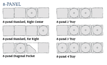
These are a few examples of the different panel designs you can use for a digipak. I found these on a really great website, which makes all of the digipaks from 100% Green Forestry Practices Certified board stock and high-quality vegetable based ink on both the boards and the discs. What I really love about these digipaks in particular is the custom designs people have ordered. I especially like this one: 

I really like the unique idea of the middle panel having a pocket in it for a small booklet. This would be great for a booklet featuring the lyrics of the songs, which you often see with albums. I would also like to use a 6 panel digipak as there is more opportunity for adding different features such as a list of tracks, the lyric booklet, disc tray and plenty of images. I'm really excited about creating a digipak and can't wait to decide what I would like the end result to look like!

Digipak and Album Cover Research

I have started to look at different digipak designs to help me form an idea of what I would like my own digipak to look like.


The traditional and more common form of CD packages are jewel cases. The clear plastic cases are made up of three pieces of plastic. Digipaks however, typically consists of paperboard or card panels with one or more plastic trays to hold the disc(s). You can also get digipaks which have 'soft-spots' rather than a plastic tray, usually a small circle of felt which you can pop the CD onto. Digipak editions of albums are often of limited edition and contain bonus tracks.


I began by looking at a few different digipaks from all genres, to compare and contrast them, as it's quite difficult to pin-point just what alternative rock is as a genre. It's a pretty vast area as there are so many sub-genres within it. I feel that my track is most likely 'noise-pop'. Also, through my band and record label research I realised that often alternative rock groups and artists use a fusion of many different genres to create their own 'unique' sound. 


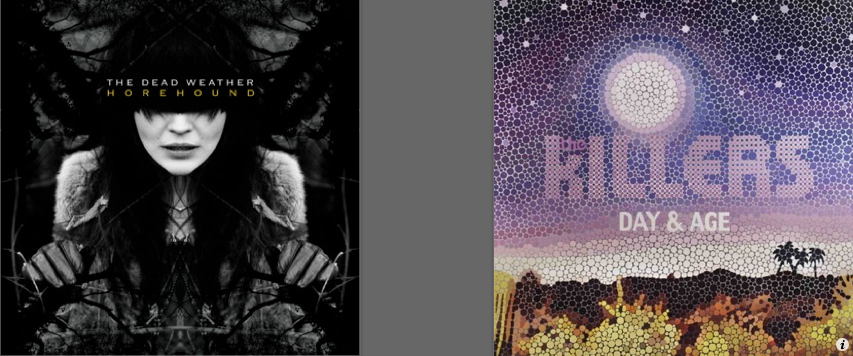
My favourite cover out of these is probably the Dead Weather: Horehound cover. The darkness and tree like shapes in the background are similar to the sinister theme I wanted to convey in my own video. Though, if I wanted to base my digipak on a lighter tone I also like the Paramore cover featuring the butterfly as it is simple yet effective and the bright butterfly wings really catch your eye.

The Dead Weather - Horehound (2009)

Friday, 7 October 2011

Shot/Lighting Inspiration

Saw this music video through a friend today and really loved the first few shots that are used! Not sure if I could incorporate some like this into my video but would like to.


Thursday, 6 October 2011

Record Labels

In order to create a realistic and professional digi-pack I have been researching record labels which would be likely to sign my band. I started out by looking at bands and artists who had a similar sound and genre to my track. The six main bands I looked at were Muse, Primal Scream, Queens of the Stone Age, Tool, Autolux and Biffy Clyro. The SlideShare below shows my research and final decision.


Sunday, 2 October 2011

Film Inspiration

In Her Skin is a 2009 Australian thriller about the search of a missing girl. Her killer turns out to be someone her family least suspected; her ex-baby sitter.


It think the idea of using a female as the stalker figure is a really unique idea. Especially if her identity isn't revealed until the end!

Friday, 30 September 2011

Focus Group Feedback

Recently I presented my ideas to the rest of my class. I explained my ideas of using the woods and a sinister story-line and then how, through the lyrics, I thought of using a stalker. We also re-played the song so they could listen and even played it over the start of 'Winter Stalker'.

Here are a few suggestions that people made:
  • Include lip-syncing in the form of writing and mouthing the lyrics - possibly writing a letter.
  • Using black blood instead of red blood - could prevent it become clichéd.
  • Keep the idea of Kristie running through the forest.
  • Whilst some agreed with the video being sinister, a couple of people questioned this.
  • The best suggestion and idea I was given was whether the stalker should be male or female.
I found the discussion really useful, as a first form of audience feedback. I was also intrigued by the idea of using another female as the 'stalker' character so I would like to look into it more.

    'Stalker' Inspiration

    Whilst looking for some inpsiration I came accross this video on Vimeo:


    The Winter Stalker from Stephen Reedy+ZerofriendsFilms on Vimeo.


    'The Winter Stalker' is an extremely creepy short holiday horror film by Stephen Reedy and Alex Pardee. When I started watching it I actually found it very scary! Obviously the end is completely different, but I love some of the shots included. I also really like the low key lighting and the mix of slow motion and normal paced shots.

    I even tried playing my track over the beginning of the video and it went really well! This has convinced me to change my idea slightly to a concept of the girl being 'stalked'.

    Idea Developments

    When I looked over my first idea again, I found that it sounded much too cliche, so I went back to the lyrics! After I read them through  a few times I tried to think of some slightly different ideas.

    Eventually I recognised some lyrics as almost 'idolising' the subject of the song. For example;
    "I see your blood is liquid light"

    "Your teenage eyes"

    "Your glittering gut parts to the dawn"

    Not only do these lyrics create great imagery, they also highlight some aspects that I would like to make key in my video, especially the age and innocence of Kristie. This gave me the concept of her being 'stalked' by another person.


    First Concept/Narrative Idea

    I came up with the idea of Kristie running/exploring in the forest (loads of opportunities for different shots). Every now and then she turns around and laughs/smiles at camera -- but within these shots there is a flashback/forward (the audience don't know) of her running terrified... kind of like a graphic match of her two expressions.

    She finally runs to this odd, run down hut thing (it's in the forest near my house) and goes inside. She finds a piece of broken mirror (referred to in the lyrics) and picks it up. When she looks in it, her reflection has blood all over her face.

    She touches her face but there is no blood. As she goes to leave, she sees a girl and a scary figure (haven't decided what he looks like yet) struggling and watches from inside the hut. She witnesses the man kill the girl and leave, so she runs to help the girl. As she does so she drops the piece of mirror.

    She runs to help the girl, but when she arrives at the place she doesn't find a body, just an identical piece of mirror to the one she dropped. She looks in it once again and sees blood on her face, and the audience see the reflection of the scary man standing behind her. He mouthes the last lyrics "Baby you're never gonna let it go" just as the song finishes.