Thursday, 29 December 2011

Narrative Storyline Alterations

Rather than focus on the direct exploitation of underage models, I want to look more indirectly at the effects of sexualisation of young girls in the media. I felt that the idea of direct exploitation is a very sensitive subject and I would have to be careful with how I went about filming it, as I had some trouble with my magazine advert; as it implied nudity I had to be very careful about who my model was.

I went back to the drawing board! I had recently watched an in-depth documentary on Channel 5 entitled "Kate Thorton - Anorexic: My Secret Past". It focused on the actresses childhood and teenage years, when the pressure of aspiring to be an actress caused her to develop Anorexia Nervosa. Again, I was reminded of the Dove advert for their campaign.

Using the combined ideas of how advertising in the fashion industry puts pressure on girls to look good and the development of psychological disorders, I will still be able to use some of my original ideas. This means that I can safely explore the controversies and won't have to worry about representing something which is too risky! However, I still need to be sensitive about the subject and how I use Kristie to portray Anorexia and the causes.

Wednesday, 14 December 2011

Choosing My Magazine Advert

After getting some feedback on my original advert I decided to play around with the layout of the text.


Above are two of the rough layouts I came up with. Someone suggested I try putting the band name at the top so I tried this. However, this made the middle space look very empty, so I moved the album information into the centre to fill the space.

Final Advert

It was pointed out to me that using a release date would significantly reduce the amount of time a advert can be shown for. I decided to change the release information so that the advert could be featured in magazines over a longer period of time. I also played around with the levels of the image, adjusting brightness and contrast to make it stand out more. 
Overall I am really pleased with my poster. I feel that my research into conventions of alternative rock advert and album covers really influenced my final product.

Sunday, 20 November 2011

Magazine Advert Feedback

I posted a picture of my Advert on my Facebook wall and asked people to give me some feedback.

I am really pleased with the responses and have found all of the comments really helpful. I want to try out some different layouts for my advert, so I can compare them and see which work best!

Creating My Magazine Advert

My model came over to the photography studio after school so that I could take some photographs of her holding my signs. She was really willing to pose how I wanted and was comfortable with the shots. She is also 18 so there are no problems with the suggested nudity. I needed to take some test shots first to make sure the studio lighting was correct and that the camera was focused.
 
 
 It didn't take long because I knew exactly what I wanted the photographs to look like. I took shots with the model in different parts of the frame; below are a few of the results.
I decided that the last photo would look good on the magazine advert, where as the landscape, more centred photos would look best on the album cover. I was really pleased with the photos as they looks really effective and the signs stood out too.
I needed to create a new band 'logo' to go on both my advert and my digipak. This time I just went for black and white as I thought this would go best with my photo; I did not want the writing to take away from the photo, just to soften it slightly. 
I went online to look for a suitable font. In the past I have found this method really useful as you can discover some really unusual but effective fonts to download for free. I came across one called 'Bright Young Things'. When I gained feedback, many agreed that the font went with the alternative rock genre of my song, which was really good to know. I decided to use this font for my logo.
I did need to retouch the photographs a bit. I found this quite easy as I have used photoshop before. I used the clone stamp tool to edit the underwear out of the photograph as I felt it was ruining the illusion.
 Although some adverts do not feature a record label logo, I decided to add mine. I found the Beggars Banquet logo online and pulled that onto the poster. I decided to put it in the bottom right corner of the poster so it is not too obvious but can subtly be seen.
 I erased some of the background on the image to make it blend in nicely with the advert background.
The finished advert! I will be getting some audience feedback on it to see how effective it is.

Tuesday, 15 November 2011

Preparing for My Advert Photoshoot

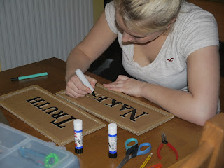
I had an idea in my head of what I wanted my signs to look like for the album cover image/advert image. I wanted the signs to stand out a bit more rather than just write on cardboard, so I decided to try cutting out each letter and sticking them on another piece of cardboard. 
I started by printing out the words 'Naked Truth' off the computer, in a font I liked, large, on two pieces of A4 paper. I then cut out each letter individually, put it on a piece of cardboard and drew around it in pencil.
I then used a small craft knife to cut out the cardboard letter. This proved really tricky!
Both words completed.
I also had to make sure the cardboard was wide enough to cover the body.
To make the sign stand out more I decided to put a border of cardboard around the edges, made out of strips of leftover cardboard.
I just stuck the letters and border on using Prit-stick.
I found that when I took photographs of the signs using the flash, the letters didn't stand out. I coloured in the letters and borders using black marker pen.
The final signs! I am really, really pleased with how they look and hope they look good in my photographs.

Monday, 14 November 2011

Developing My Advert Idea

After creating my mock-up advert, I realised that I needed to research some other alterntive rock magazine adverts. It proved quite difficult to find them as many 'rock' magazines such as "Kerrang!" didn't actually feature any advert for albums. I had a look on the internet too, though the more common adverts were for the pop and RnB genres. Through research of these adverts however I found that many share the same image as the album cover. I think that I would like my advert image and digipak cover image to be the same or similar.
Here are some album covers taken from 'alternative rock' artists or similar genres.


I have decided to go right back to basics and think about literal ideas of my band and album name. Obviously 'naked truth' can be represented quite literally, what with the basis of my video I thought it would be a fitting idea.
The cover above also inspired me. I really love the idea of using a sign with the album name written on it. I really want to make two signs out of cardboard; one that says "Naked" and the other "Truth". I want them to be held over a woman's body, the first to cover her breasts and the second to cover her bottom half. Although she will appear to be naked behind the signs, she won't be.

Sunday, 13 November 2011

Logos and Magazine Adverts

After choosing what my band would be called a began to experiment with some logos which I could use on the magazine advert and the digipak. This is an initial logo I have come up with. I decided to link the first letter of each word as they are all nicely curved. Obviously the acronym of the band name is SOD! I also thought the logo needed some colour and decided to use the colour red because black and red are recognised colours within the 'rock' genre.
I then changed the font used in my logo and decided that I preferred this one.
Even without thinking about designing my advert, I was playing around with some new Photoshop 'brushes' and created the image below. Even though I was just messing around, I was really pleased with the effect they gave and thought this may look quite good on an advert.
I then started to create an advert as a 'mock-up', just adding whatever came to mind and laying it out in different ways. 
When looking for feedback, it was apparent that "Naked Truth" looked more like the name of the band, rather than the name of the album.
I decided to swap the two titles around to make it very clear that "Second One Down" was the band name and "Naked Truth" was the album name and it looked much better.
 However, this poster was only a mock-up. Other feedback I received revealed that people thought it looked more like a film poster than an advert and quite like a 'Twilight' film poster in particular. Although this was not an adequate advert, I have learnt a lot through the process, especially that feedback from others is invaluable!
I also need to look at some alternative rock magazine adverts to get an idea of the kinds of images and text they use to advertise bands and albums.

Friday, 11 November 2011

Names, Names, Names!


As I need to start creating my poster and digipak, I really needed to come up with names for the band, album and the song! It was a lot more difficult than I thought it would be. I began by looking at the lyrics in my song for song names and jotted down any names that came to mind. I also looked at the names of current alternative rock bands on Wikipedia to get a feel for the types of names I could use.


The names I have decided on are:
Band Name - Second One Down
Album Name - Naked Truth   (second choice was Preserving Common Sense)
Song Name - Breaking Apart   (second choice was Mirrors)

Thursday, 3 November 2011

Shot List Vs. Storyboard

As I've begun to really plan what shots I want in my video, I have found it increasingly difficult to log them. I started to create a storyboard, but I found that it took much too long and it was hard to decide which shots could go where. I just couldn't create a sequence of drawings. 


I then decided to have a look at shot lists. I created a template on Word which I could fill in as I came up with shot ideas:
I found it much easier using the shot list, because I want many of my shots and cuts to coincide with the beats of the song. This means that the shot list is precise and I can shoot efficiently. It can also be used during the editing process. To fill it in I listened to the music, looked at the lyrics and visualised what I want to happen at certain points within the video.


Using the shot list has proved really effective, however I also like to sketch out a shot here and there to see what it would look like.

Friday, 28 October 2011

Shot Ideas

Whilst watching last week's episode of 'Casualty', a sequence of shots caught my eye. The storyline has been on-going based on a ex-prostitute, Annie. At the beginning of the episode Annie was visited by another of the prostitutes who wanted to warn her to run away before their pimp found out where she was. It turns out that the pimp found Annie's house and was waiting there when the other prostitute turns up.

I thought it was interesting how the different shots conveyed someone being watched, in a sinister way. I'd really like to try and create the same effect within my music video!

Monday, 17 October 2011

Exploitation of Young Female Artists

I made this video to explain a few examples.


Sexualisation of Women in the Media

I really wanted to look more closely at how the media industry began to sexualise women through advertising, television and film. I began by looking at some older adverts and discovered that the objectification of female bodies has become more and more apparent over the years.

During and after the 80's most picked up on the notion that sex really does sell. It became more common to see increasingly sexual advertisements. The American Apparel and Gossip Girl interest me in particular because of the ages of the girls; they look too young to be featured in these adverts.


Now I have a basic idea of the ways in which sexualisation and objectification have developed in the media, I would like to focus in on music videos and the objectification of both female artists and video extras used in male artists' videos. It is also important that I look at contemporary examples of young girls in music videos.